Chapter 1: Starting with a Spark: Design Tools and How To Use Them
A Blank Page
You open a new screen in Procreate or crack open your brand-new sketchbook and see a blank page. It can become whatever you want it to be. You in collaboration with your fellow designers and the director of this play get to create a world. A world that allows your audience to escape their lives for a short while. A world where actors get to step into the lives of someone else; gaining new experiences by learning from their character's choices. You are a magician teleporting people into a fantasy or another time and place. You are magic and it starts with a blank page.
Many people think that being a creative person means there are no rules; that you are a constant flow of creative energy that explodes into the world. However, the reality is that even the most eccentric creatives work within or around guidelines to help us focus our creative energies. When it comes to theatrical design those guidelines are called the elements and principles of design. The elements refer to the basic components that make up a design, while the principles govern how those elements are used and arranged. Together, they guide the designer in creating cohesive, effective, and meaningful visual concepts. If you are a foodie, like me, I offer you this analogy: The elements are the ingredients and the principles are the recipe that’s used to create your favorite meal.
What Is Theatre Production and Design?
Theatre production and design is the creative and technical foundation of live performance. It involves the integration of visual, spatial, and sensory elements that support storytelling onstage. While actors bring the characters to life, designers and technicians shape the world in which those characters live. Everything the audience sees, hears, or experiences beyond the actors’ voices—lighting, sound, costumes, sets, props, and multimedia—is the result of intentional design choices. The work is inherently collaborative, requiring designers to work closely with directors, stage managers, and production staff to translate the words of a script into a shared visual and emotional reality.
Production and design in theatre encompass a wide range of disciplines. Scenic design creates the physical environment of the play, whether realistic or abstract. Costume design shapes the appearance of characters and communicates aspects of personality, status, and time period. Lighting design uses intensity, color, angle, and movement to support mood, focus, and transitions. Sound design crafts the aural landscape of a production through sound effects, ambient noise, and underscoring. Additional areas include props design and management, media and projection design, and technical direction, which ensures the execution of all visual and technical aspects of a production. Each of these disciplines play a crucial role in the holistic storytelling experience.
Due to the complexity and diversity of this field, there are many different jobs in theatre production and design. These include artistic roles such as scenic, costume, lighting, sound, and projection designers; as well as technical and managerial roles like technical directors, production managers, stage managers, and master electricians. Specialized craftspeople—such as scenic artists, carpenters, stitchers, props artisans, and AV technicians—are essential to turning designs into reality. Professionals in this field may work in regional theatres, educational institutions, Broadway and touring productions, theme parks, museums, cruise ships, film and television, or even virtual environments. Theatre production offers career paths for creative visionaries, meticulous planners, and hands-on builders alike.
And yet, before the first piece of wood is cut or the first sketch is drawn, every design starts the same way: with a blank page.
The Elements of Design
The elements of design are the building blocks that artists use to create visual compositions. In theatre, these elements are applied to the design of sets, costumes, lighting, and props. The primary elements include:
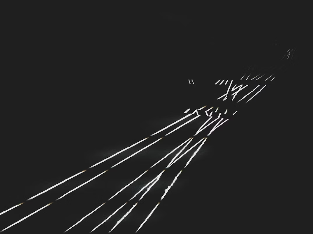
1. Line
Line refers to the path created by a moving point, and it is one of the most basic elements of design. In theatre, lines can be used in various ways to shape space, create mood, and suggest movement.
Types of Line:
Horizontal lines suggest stability, calmness, and tranquility. They are often used in set design to create a grounded, balanced atmosphere.
Vertical lines convey height, strength, and formality. They can be used to create a sense of aspiration or grandeur.
Diagonal lines imply movement, energy, and dynamism. These lines can suggest action, conflict, or instability.
Curved lines evoke softness, fluidity, and organic shapes. They are often used in costume or set designs to convey a sense of elegance or naturalism.
2. Shape
Shape refers to the two-dimensional outline of an object or figure. In theatre, shapes are used to define space and create visual interest.
Geometric Shapes: These include circles, squares, and triangles, which often have a sense of structure and clarity. Geometric shapes can be used to define architectural elements in set design or to create bold, graphic visual statements.
Organic Shapes: These shapes are more fluid and irregular, often mimicking natural forms. In theatre, organic shapes might be used in set or costume design to suggest a natural world or organic growth, such as plants or bodies.
3. Color
Color is a powerful tool in theatre design, as it has the ability to evoke mood, create focus, and enhance the emotional impact of a production.
Color Wheel: Designers often use the color wheel to explore relationships between colors. Complementary colors (those opposite each other on the color wheel) create contrast and vibrancy, while analogous colors (those next to each other) create harmony and cohesion.
Color Temperature: Warm colors (reds, oranges, yellows) are associated with energy, passion, and warmth, while cool colors (blues, greens, purples) evoke calmness, melancholy, and distance. Lighting designers often use color temperature to create atmosphere or to shift the emotional tone of a scene.
4. Texture
Texture refers to the surface quality of an object, whether it is rough, smooth, soft, or hard. Texture in theatre design can refer to the actual materials used in the set, costumes, or props, or it can describe the visual appearance of those materials.
Tactile Texture: This is the physical texture that can be felt, such as the roughness of a brick wall or the softness of velvet curtains.
Visual Texture: This refers to the illusion of texture created through lighting, painting, or fabric choice. For example, a flat painted backdrop may appear to have a texture that suggests stone or wood.
5. Space
Space is the area in which a design exists and can be manipulated through the arrangement of objects, performers, and scenery. In theatre, space is often conceptualized as both positive space (the area occupied by objects or performers) and negative space (the empty ares between and around objects).
Depth: The use of perspective in set design can create the illusion of depth, giving the audience a sense of three-dimensional space in a two-dimensional theatre.
Proximity: The placement of objects or performers in relation to each other can convey meaning. For instance, characters who are close together may suggest intimacy, while characters who are far apart may indicate emotional distance or isolation.
The Principles of Design
The principles of design govern the use of the elements of design and how they can be combined to create visually and emotionally effective compositions.
1. Balance
Balance refers to the distribution of visual weight in a design. It can be achieved in three main ways:
Symmetrical Balance: This occurs when elements on either side of a central axis are identical or very similar. Symmetry creates a sense of stability, order, and formality.
Asymmetrical Balance: This involves the unequal distribution of elements, often based on size, color, or weight. Asymmetry is dynamic and creates a sense of movement or tension.
Radial Balance: This occurs when elements radiate from a central point, creating a sense of focus and unity.
2. Contrast Contrast refers to the juxtaposition of different elements to create visual interest, highlight specific areas, or enhance the dramatic effect. In theatre design, contrast can be achieved through:
Light and Dark: The use of light and shadow can create strong contrasts, drawing attention to particular elements on stage.
Color: Contrasting colors, such as using complementary hues or a mix of warm and cool colors, can make certain elements stand out.
Size and Scale: A large object next to a small one, or an oversized costume next to a smaller set piece, creates contrast in scale.
3. Emphasis
Emphasis is the principle of drawing attention to a particular area or element in a design. In theatre, emphasis is often achieved through the use of focal points, such as a brightly lit character or a central piece of scenery.
Contrast: Using contrast is an effective way to emphasize important elements, such as making a leading character stand out through color or lighting.
Placement: Elements placed in the center of the stage or in a position of prominence naturally attract more attention.
Isolation: Isolating an object or character in a scene can make it the focal point, drawing the audience’s attention.
4. Rhythm
Rhythm in design refers to the repetition or alternation of elements to create a sense of movement or flow. Just as rhythm in music creates patterns of sound, rhythm in visual design helps guide the viewer's eye and creates a dynamic experience.
Repetition: Repeating colors, shapes, or textures can create a rhythmic flow that unifies the design and keeps the audience's attention engaged.
Variation: While repetition is important, varying the size, shape, or color of repeated elements can prevent monotony and create visual interest.
5. Unity and Harmony
Unity refers to the cohesive and consistent use of design elements to create a sense of oneness in a production. When elements are in harmony, they support the overall aesthetic and thematic goals of the production.
Consistency: Maintaining a consistent visual style in costumes, sets, and lighting helps create unity. For example, a production set in the 1920s might feature period-appropriate costumes, props, and set pieces to support a unified concept.
Thematic Connection: Designers use elements like color, texture, and shape to tie the design together and reflect the themes of the play, helping to reinforce the story’s emotional and intellectual impact.
6. Proportion and Scale
Proportion refers to the relative size of elements in relation to one another. Scale is concerned with the size of elements in relation to the stage and the human body.
Human Scale: Designers often work with human scale to create a sense of relatability or realism. For example, a chair designed for a small child may be intentionally scaled to appear unusually large when compared to an adult's chair.
Exaggeration: Sometimes, elements are purposely designed to be larger or smaller than life to create a particular effect, such as in a fantasy or expressionist play.
Forced Perspective: Forced perspective is a trick that uses visual illusion to make something look bigger, smaller, farther away, or closer than it really is.
Color Theory
Color is one of the most powerful tools in a theatre designer’s arsenal, influencing mood, character, and perception. Whether through costume, lighting, or scenic design, color plays a pivotal role in how an audience experiences a performance. Understanding color theory and its application is essential for creating a cohesive visual environment that enhances the storytelling process.
The Basics of Color Theory
Color theory is grounded in the science and art of color mixing and the relationships between colors. In theatre, we must understand that pigment-based color theory and light-based color theory use different primary colors and operate under different systems. Pigments (like paint and fabric dyes) follow the subtractive model with red, yellow, and blue as primary colors, while lighting follows the additive model, using red, green, and blue (RGB). Recognizing this distinction at the outset helps avoid confusion when transitioning between costume or scenic design and lighting design. For theatre designers, color theory helps guide decisions about the use of color to communicate themes, evoke emotions, and establish the world of the play. At its core, color theory involves:
Primary Colors: Red, blue, and yellow. A color that cannot be created by mixing two (or more) colors together. These are the building blocks of all other colors.
Secondary Colors: Green, orange, and purple. Created by mixing two primary colors.
Tertiary Colors: A combination of a primary and a secondary color (e.g., red-orange, blue-green, etc.).
In addition to understanding how colors are created, designers also need to be aware of the relationships between colors, which include:
Complementary Colors: Colors that are opposite each other on the color wheel (e.g., red and green, blue and orange). These pairs create visual tension and contrast, making each color appear more vibrant. Complementary color schemes are often used to highlight conflict or create energy on stage.
Split-Complementary Colors: A variation of the complementary color scheme, using a base color and the two adjacent colors to its complement (e.g., blue, red-orange, and yellow-orange). This provides contrast while maintaining more balance than a strict complementary scheme.
Analogous Colors: Colors that are next to each other on the color wheel (e.g., blue, blue-green, green). These create harmonious, serene effects and are often used in scenes of peace, unity, or tranquility.
Monochromatic Colors: Variations of a single hue using its tints (lighter), tones (muted), and shades (darker). Monochromatic schemes create cohesion and can emphasize mood or emotion without distraction from multiple hues.
Triadic Colors: Three colors evenly spaced around the color wheel (e.g., red, blue, and yellow). This scheme creates vibrant harmony with a more dynamic feel than analogous colors and is often used to energize a scene while maintaining balance.
Tetradic Colors (Double-Complementary): A color scheme using two pairs of complementary colors (e.g., red and green, blue and orange). This creates rich, complex visuals but requires careful balance to avoid overwhelming the viewer.
Square Colors: Four colors evenly spaced around the color wheel (e.g., red, yellow-green, blue, and violet). This scheme offers diversity and strong visual interest while maintaining harmony, often used in more stylized or surreal designs.
The Psychological Impact of Color
Colors evoke specific emotions and associations that can influence the audience's emotional response to a performance. Our emotional responses to color can vary based upon our cultural backgrounds. Designers often use color to create a psychological environment that reinforces the themes or tone of a play.
Red: Often associated with passion, love, danger, or anger, red can create intense emotional reactions. It is a powerful color for characters or scenes with high energy or conflict.
Blue: Typically linked to calm, sadness, or coldness, blue can evoke a sense of peace or melancholy. It can be used to portray introspection or create an atmosphere of quiet contemplation.
Yellow: Associated with warmth, optimism, and happiness, yellow can also represent caution or sickness. It is a color that catches the eye and can be used to draw attention to specific elements.
Green: Symbolic of nature, growth, and renewal, green can also be used to evoke jealousy, envy, or even decay (depending on its shade). It is versatile, balancing the energetic tones of yellow and the calming effects of blue.
Purple: Often tied to royalty, mystery, or spirituality, purple can convey luxury or enigma. It is a color that evokes a sense of grandeur or magic.
Black: Symbolizing darkness, death, and the unknown, black is a strong color for creating a sense of drama, tension, or solemnity. It is also used to denote authority or elegance, especially in costume design.
White: Representing purity, innocence, and light, white can also be used to signify emptiness or sterility. It is a color of clarity and openness but can also be stark or uncomfortable in certain contexts.
Cultural and Historical Context of Color
The meanings and associations of color can vary widely depending on cultural context. A color that signifies one emotion or idea in one culture may have a completely different connotation in another. For example:
In Western cultures, white is often associated with weddings and purity, while in some Eastern cultures, it symbolizes mourning and death.
Red may symbolize love and passion in many cultures but is also a color of danger and warning, particularly in certain Asian and African cultures.
When designing a production, it’s important to consider the specific cultural, historical, and geographical context of the story being told. A designer’s awareness of these nuances ensures that the chosen color palette resonates with the intended meaning, enhancing the communication of themes.
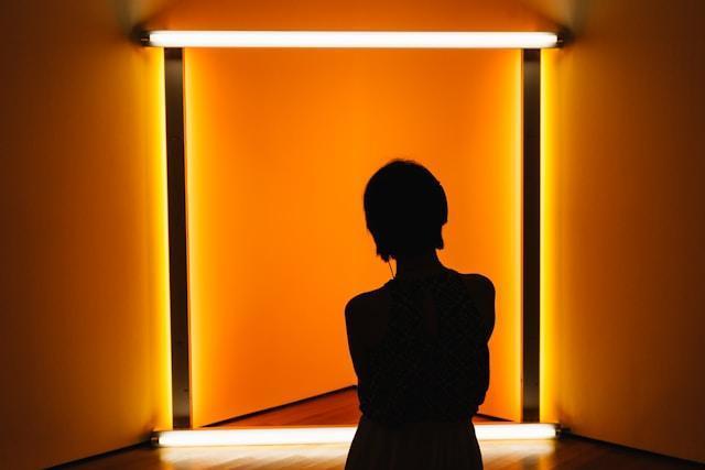
Color in Lighting Design
In theatre lighting, color is manipulated through gels (filters), LED fixtures, and digital projection to shape atmosphere, direct focus, and even influence how set and costume colors appear onstage. The emotional impact of lighting is especially powerful because color can shift in real time during a performance, adding dynamic layers to the storytelling. Through intentional color mixing and control, lighting designers create effects that enhance the story’s atmosphere, suggest time of day, or amplify emotional tone. A thoughtful balance of warm and cool tones is often used to modulate the emotional intensity of a scene and support the audience’s experience.
Warm Colors (Reds, Oranges, Yellows): These create feelings of warmth, intimacy, and energy. They are often used to create a sense of closeness, intensity, or excitement. In lighting design, they can suggest the time of day (e.g., sunset) or imply heat or passion.
Cool Colors (Blues, Greens, Purples): Cool colors evoke calm, tranquility, and sometimes detachment or isolation. Lighting designers use cool colors to create nighttime effects, to evoke coldness, or to generate a sense of space or distance.
Monochromatic Lighting: Using varying intensities and saturations of a single color can create a mood of simplicity, unity, or even melancholy. This approach is often seen in scenes that require subtle emotional shifts or when isolating specific characters or moments.
Color in Costume Design
Costume designers use color to define characters, reflect their psychological states, and suggest relationships between individuals. As a character evolves over the course of a production, changes in costume color can symbolize shifts in their arc or emotional journey. The colors chosen for costumes help establish mood and communicate specific traits, both for individuals and for groups. A cohesive color scheme across the cast can visually unify the ensemble, while intentional contrasts can highlight tension or difference between characters.
Character Definition: Bright colors can suggest bold, extroverted characters, while darker tones can denote introversion, seriousness, or villainy. A character who wears a lot of black, for example, may be perceived as mysterious or menacing.
Symbolism: Colors in costumes often carry symbolic meaning. A white gown can evoke purity, while red can be used to signify passion, danger, or even aggression. Designers often manipulate these associations to deepen a character’s identity or to foreshadow events.
Color Contrast and Interaction: The way colors interact on stage is just as important as the colors themselves. Designers use contrasting colors to create visual tension between characters or groups, drawing attention to specific relationships. For instance, pairing a character’s green costume with a red background may visually underscore themes of jealousy or rivalry.
Color in Set Design
Scenic designers use color to establish setting, suggest mood, and support the emotional arc of the story. The color palette of a set can ground the audience in a particular time period, cultural context, or psychological landscape. As the production unfolds, changes in set lighting or modular elements with varied colors can reflect shifts in tone, season, or narrative progression. Whether realistic or abstract, scenic color choices help frame the action and guide the audience’s emotional response.
Environmental Mood: Earthy tones might suggest a grounded, naturalistic world, while stark whites or greys may evoke sterility, isolation, or futurism. Warm hues can create intimacy and comfort, whereas cool tones might suggest distance, melancholy, or formality.
Thematic Symbolism: Colors in the set often carry thematic weight. A decaying red wall might symbolize danger or past violence, while a vibrant yellow kitchen might evoke nostalgia, hope, or even false cheer. Scenic designers can use these associations to reinforce the subtext of a scene or to contrast what is spoken with what is visually suggested.
Color Harmony and Focus: Just as costume designers consider how colors interact, scenic designers must balance hues across floors, walls, furniture, and props. Color harmony creates cohesion, while selective contrast can direct attention. For instance, a single brightly colored doorway in a neutral-toned set can draw the audience’s eye and suggest a focal point, transition, or escape.
Conclusion
The elements and principles of design are essential tools for theatre designers. They help transform abstract ideas into visual and sensory experiences that support and enhance the narrative of a production. By understanding how to manipulate line, color, texture, shape, space, and other elements, designers can create environments that influence the mood, convey character relationships, and express the themes of a play. Mastering the principles of balance, contrast, rhythm, emphasis, unity, and proportion ensures that these elements work together to create a cohesive, effective design.
Design is an iterative process that requires both creativity and technical skill. It is a vital aspect of theatre that allows the audience to experience a performance not only through words and actions but also through visual and sensory cues that enhance storytelling and emotional engagement.
Showcase Your Learning
Assignment Objective: Students will demonstrate their understanding of color theory in theatrical design by applying color harmonies, psychological meaning, and design principles to a creative visual project.
Assignment Rationale: Color is one of the most impactful tools in a designer’s toolkit. By understanding how color functions emotionally, symbolically, and spatially, students can make intentional choices that support storytelling in theatre. This project invites students to apply both technical knowledge and creative exploration to communicate narrative through color.
Choose your Assignment: Choose one of the options below to showcase your learning.
Color Storyboard: Choose a short scene from a play and design a 3–5 frame storyboard showing how color would shift over time. Include notes on mood, time of day, and psychological impact for each frame.
Designer's Color Palette: Create a set, costume, or lighting color palette for a production of your choice. Use one of the major color harmonies (complementary, triadic, analogous, etc.), and explain how your choices reflect the play’s themes, setting, and emotional tone.
Mood & Meaning Collage: Make a digital or physical collage using images, textures, and color swatches that represent the emotional world of a selected character or scene. Include at least three key colors with annotations explaining their psychological or symbolic significance.
Lighting Gel Study: Using a lighting design software, app, or color overlays, mock up a lighting concept for a single moment in a play. Present how your chosen colors enhance mood, create focus, and interact with scenic and costume colors.
Cultural Color Research Poster: Research how a specific color is used symbolically in two different cultures. Create a short visual presentation or infographic comparing these uses and reflect on how cultural awareness impacts design decisions.
Scene Design Sketch: Draw or digitally create a scenic design for a single setting using intentional color choices. Annotate how color supports the setting, time period, and character dynamics.
Roll the Dice! Let fate decide from among the options above.
All submissions must include:
A written artist statement (200–300 words) explaining your concept, process, color choices, and how they support the story.
Visual or multimedia documentation (e.g., images, slides, sketches, mood boards).
Citations for any images, sources, or design references used.
A final reflection question: How did your understanding of color theory influence the decisions you made in this project?
Key Terms
Analogous Colors – Colors located next to each other on the color wheel, used to create harmonious and cohesive visual effects.
Asymmetrical Balance – A form of visual balance where elements of different sizes, colors, or shapes are arranged unevenly but still create a sense of equilibrium.
Balance – The distribution of visual weight in a design, achieved through symmetry, asymmetry, or radial arrangements.
Color Temperature – The warmth or coolness of a color, used in lighting and design to affect mood and atmosphere.
Color Theory – The study of how colors interact, their relationships on the color wheel, and their psychological effects in design.
Complementary Colors – Colors opposite each other on the color wheel, used to create contrast and visual tension.
Contrast – The use of opposing elements (light/dark, large/small, warm/cool) to create emphasis and interest.
Curved Lines – Lines that suggest softness, movement, and organic shapes, often used to evoke naturalism or fluidity.
Emphasis – A principle of design that draws attention to a specific part of a composition, often the focal point.
Forced Perspective – A visual technique used to create the illusion of depth or scale on stage.
Geometric Shapes – Shapes such as squares, triangles, and circles, often used to convey structure and order.
Human Scale – Design that relates to the size and proportion of the human body to create a sense of realism or relatability.
Line – A continuous mark that defines shapes and outlines in a design; can be horizontal, vertical, diagonal, or curved.
Monochromatic Lighting – Lighting using various shades and intensities of a single color to unify or isolate visual moments.
Organic Shapes – Irregular or natural shapes often used to suggest nature or the human body.
Primary Colors – Red, blue, and yellow; the foundational colors from which all others are mixed.
Principles of Design – Guidelines (such as balance, contrast, rhythm, emphasis, unity, and proportion) for how design elements are arranged.
Proportion – The relative size of elements within a design in relation to each other.
Radial Balance – A type of balance where elements are arranged around a central point, often creating a circular pattern.
Repetition – The repeated use of design elements to create rhythm and unity.
Rhythm – The visual flow created by repetition or alternation of elements, guiding the viewer’s eye.
Scale – The overall size of an object in relation to the space or the human body.
Scenic Design – The creation of the physical environment of a play through architecture, furniture, and space.
Secondary Colors – Colors made by mixing two primary colors (e.g., green, orange, purple).
Shape – A two-dimensional area defined by boundaries; includes geometric and organic forms.
Space – The area within and around elements in a design; includes positive (occupied) and negative (empty) space.
Split-Complementary Colors – A color scheme using one base color and two colors adjacent to its complement for a balanced contrast.
Symmetrical Balance – A type of balance where elements are mirrored on either side of a central axis.
Technical Direction – The role responsible for realizing design plans through construction, rigging, and installation.
Tertiary Colors – Colors made by mixing a primary color with a neighboring secondary color (e.g., blue-green, red-orange).
Texture – The surface quality of a material, either felt (tactile) or seen (visual), that adds depth and realism.
Theatre Production and Design – The creative and technical process of shaping the visual and sensory elements that support storytelling on stage.
Triadic Colors – Three colors evenly spaced on the color wheel, used to create vibrant and balanced compositions.
Unity – The sense of cohesion and harmony in a design when all elements work together effectively.
Visual Texture – The illusion of texture created through techniques like painting or lighting.
Warm and Cool Colors – Categories of colors associated with emotion and temperature; warm colors (red, orange, yellow) suggest energy, while cool colors (blue, green, purple) suggest calm.
Brown, D. (2018). Designing for the stage: A practical guide to theatrical design. Routledge.
Gillette, J. M. (2019). Theatrical design and production: An introduction to scene design and construction, lighting, sound, costume, and makeup (8th ed.). McGraw-Hill.
Jones, R. (2017). The dramatic imagination: Reflections and speculations on the art of the theatre. Yale University Press.
Lauer, D. A., & Pentak, S. (2020). Design basics (10th ed.). Cengage Learning.
Pilbrow, R. (2013). Stage lighting design: The art, the craft, the life (2nd ed.). Nick Hern Books.
Sporre, D. J. (2021). The creative impulse: An introduction to the arts (9th ed.). Pearson.
Crafting Theatrical Magic: Building Worlds Through Theatre Design by Bryan Stanton is licensed under CC BY NC SA 4.0